Bold colors are strong, rich, and attention-grabbing shades that stand out quickly. They include colors such as scarlet, crimson, hot pink, magenta, bright orange, lime green, emerald green, cobalt blue, royal blue, violet, indigo, and charcoal.
Learning bold color names helps readers describe powerful shades more clearly in English. These colors are useful in fashion, branding, websites, interiors, packaging, events, social media graphics, and art. Because bold colors create strong visual impact, they should be used with balance, contrast, and purpose.
In This Page
What Are Bold Colors?
Bold colors are colors that look strong, vivid, rich, or high-impact. Some bold colors are bright, while others are deep, dark, or jewel-toned. For example, electric blue looks bright and energetic, while charcoal looks dark, strong, and dramatic.
Many bold colors have high saturation or strong contrast. As a result, they can make a design feel confident, modern, energetic, luxurious, playful, or dramatic.
Bold colors can include:
- Bright colors
- Vivid colors
- Deep colors
- Jewel tones
- Strong dark shades
- High-contrast colors
- Saturated colors
- Statement colors
Quick Bold Color Names Chart
This quick chart gives a simple overview of common bold colors before the detailed sections.
| Bold Color Name | Color Family | Simple Meaning | Common Use |
|---|---|---|---|
| Bold Red | Red | Strong red shade | Branding, fashion, alerts |
| Scarlet | Red | Bright red-orange | Events, logos, outfits |
| Crimson | Red | Deep rich red | Luxury, fashion, decor |
| Ruby Red | Red | Jewel-like red | Jewelry, beauty, packaging |
| Cherry Red | Red | Bright fruit-like red | Fashion, cars, branding |
| Hot Pink | Pink | Strong bright pink | Fashion, beauty, pop designs |
| Magenta | Pink/Purple | Bold pink-purple | Graphics, branding, fashion |
| Fuchsia | Pink/Purple | Vivid pink-purple | Flowers, dresses, packaging |
| Bright Orange | Orange | Strong orange shade | Sports, signs, branding |
| Tangerine | Orange | Bold orange fruit shade | Fashion, summer designs |
| Lemon Yellow | Yellow | Bright yellow shade | Posters, signs, kids’ designs |
| Lime Green | Green | Bright yellow-green | Sports, packaging, graphics |
| Emerald Green | Green | Rich jewel green | Interiors, fashion, luxury |
| Turquoise | Blue/Green | Bold blue-green | Jewelry, decor, travel themes |
| Cobalt Blue | Blue | Strong deep blue | Fashion, art, interiors |
| Royal Blue | Blue | Rich formal blue | Uniforms, branding, decor |
| Electric Blue | Blue | Very bright blue | Digital design, sports, tech |
| Violet | Purple | Strong purple shade | Beauty, art, fashion |
| Amethyst | Purple | Jewel-like purple | Jewelry, decor, beauty |
| Charcoal | Dark Neutral | Deep gray-black | Interiors, suits, websites |
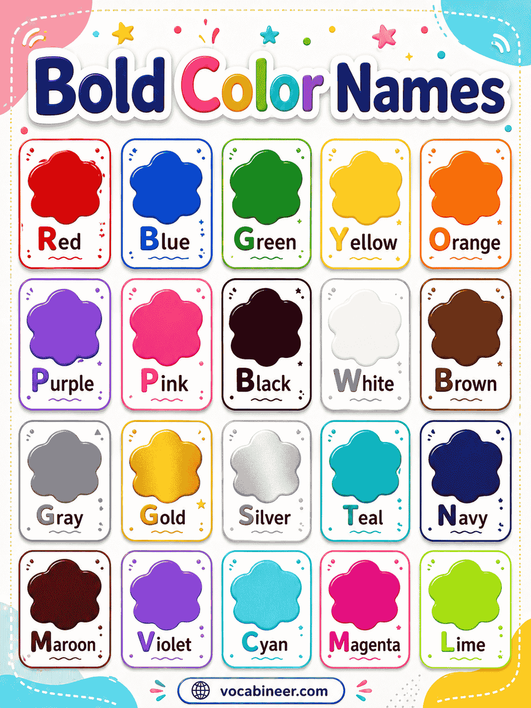
Common Bold Color Names with Pictures
Pictures help learners recognize bold colors by brightness, depth, contrast, and visual strength.
Bold Red
Bold red is a strong red shade that quickly catches attention. It works well in logos, fashion, signs, and statement designs.
Scarlet
Scarlet is a bright red with a slight orange tone. Designers often use it for energetic, festive, or dramatic looks.
Crimson
Crimson is a deep rich red that feels strong and elegant. It suits luxury fashion, flowers, interiors, and formal designs.
Ruby Red
Ruby red is a jewel-like red inspired by the ruby gemstone. This shade creates a polished, romantic, and luxurious effect.
Cherry Red
Cherry red is a bright fruit-like red. It often appears in cars, lipstick, clothing, packaging, and playful branding.
Hot Pink
Hot pink is a bold bright pink with a lively feel. Fashion, beauty, posters, and pop-style graphics often use this color.
Magenta
Magenta is a strong pink-purple shade. It brings energy to digital designs, fashion, packaging, and creative branding.
Fuchsia
Fuchsia is a vivid pink-purple color inspired by the flower. This shade feels bright, stylish, and expressive.
Bright Orange
Bright orange is a strong orange shade that feels active and warm. It works well in sports, signs, events, and modern branding.
Tangerine
Tangerine is a bold orange shade with a fresh fruit-like look. Summer fashion, packaging, and cheerful designs often use it.
Coral
Coral is a warm pink-orange shade. In bold palettes, it adds energy while still feeling friendly and stylish.
Lemon Yellow
Lemon yellow is a bright yellow shade with a sharp, sunny look. It stands out in posters, labels, signs, and playful designs.
Golden Yellow
Golden yellow is a rich yellow shade with a warm appearance. It can make designs feel confident, cheerful, or premium.
Lime Green
Lime green is a bright yellow-green shade. Sportswear, packaging, posters, and youth-focused designs often use it.
Emerald Green
Emerald green is a rich jewel green. It creates a luxurious, natural, and confident look in fashion, interiors, and branding.
Turquoise
Turquoise is a bold blue-green shade. It feels fresh and lively, especially in jewelry, decor, travel themes, and summer designs.
Teal
Teal is a strong blue-green color with depth. It can look modern, stylish, and balanced in interiors, websites, and branding.
Cobalt Blue
Cobalt blue is a deep, strong blue. Artists, designers, and fashion brands use it for bold but polished visual impact.
Royal Blue
Royal blue is a rich blue shade with a formal and confident feel. It appears in uniforms, logos, decor, and elegant clothing.
Electric Blue
Electric blue is a very bright blue shade. It works well in digital graphics, tech designs, sportswear, and modern visuals.
Sapphire Blue
Sapphire blue is a deep jewel-like blue. It feels luxurious, classic, and powerful in fashion, jewelry, and branding.
Violet
Violet is a strong purple shade. It can feel creative, artistic, and dramatic in beauty, fashion, and event designs.
Amethyst
Amethyst is a jewel-inspired purple shade. It gives designs a rich, elegant, and slightly mysterious look.
Indigo
Indigo is a deep blue-purple color. It feels bold, calm, and sophisticated in textiles, interiors, and branding.
Charcoal
Charcoal is a deep gray-black shade. It creates strong contrast and works well in interiors, suits, websites, and modern layouts.
Bold Color Names and Meanings
This table explains bold color names in simple English for vocabulary learners, designers, and readers.
| Bold Color Name | Simple Meaning |
|---|---|
| Bold Red | A strong and powerful red |
| Scarlet | A bright red-orange shade |
| Crimson | A deep rich red |
| Ruby Red | A jewel-like red |
| Cherry Red | A bright fruit-like red |
| Hot Pink | A strong bright pink |
| Magenta | A bold pink-purple color |
| Fuchsia | A vivid pink-purple shade |
| Bright Orange | A strong orange color |
| Tangerine | A bold orange fruit shade |
| Coral | A warm pink-orange shade |
| Lemon Yellow | A bright yellow shade |
| Golden Yellow | A rich warm yellow |
| Lime Green | A bright yellow-green |
| Emerald Green | A rich jewel green |
| Turquoise | A bold blue-green |
| Teal | A strong deep blue-green |
| Cobalt Blue | A deep strong blue |
| Royal Blue | A rich formal blue |
| Electric Blue | A very bright blue |
| Sapphire Blue | A jewel-like blue |
| Violet | A strong purple shade |
| Amethyst | A jewel-like purple |
| Indigo | A deep blue-purple |
| Charcoal | A strong dark gray |
Bold Colors by Color Family
Grouping bold colors by family makes them easier to compare. Each family has its own energy, mood, and common use.
Bold Red and Pink Colors
Red and pink bold colors often feel energetic, emotional, romantic, or dramatic.
| Color Name | Look and Feel | Common Use |
|---|---|---|
| Bold Red | Strong and powerful | Logos, fashion, alerts |
| Scarlet | Bright and lively | Events, dresses, signs |
| Crimson | Deep and elegant | Luxury, flowers, interiors |
| Ruby Red | Rich and polished | Jewelry, beauty, packaging |
| Cherry Red | Bright and playful | Cars, lipstick, clothing |
| Hot Pink | Lively and bold | Beauty, fashion, posters |
| Magenta | Creative and bright | Graphics, branding, fashion |
| Fuchsia | Stylish and vivid | Dresses, flowers, packaging |
Bold Orange and Yellow Colors
Orange and yellow bold colors often feel warm, active, cheerful, and attention-grabbing.
| Color Name | Look and Feel | Common Use |
|---|---|---|
| Bright Orange | Active and warm | Sports, signs, events |
| Tangerine | Fresh and lively | Summer fashion, packaging |
| Coral | Warm and stylish | Decor, clothing, branding |
| Lemon Yellow | Sharp and sunny | Posters, kids’ designs, labels |
| Golden Yellow | Rich and warm | Luxury accents, logos, decor |
| Amber | Warm and glowing | Lighting, interiors, packaging |
| Marigold | Strong yellow-orange | Events, fashion, festive decor |
| Mustard Yellow | Deep and earthy | Clothing, interiors, accessories |
Bold Green Colors
Green bold colors can feel fresh, natural, energetic, rich, or modern.
| Color Name | Look and Feel | Common Use |
|---|---|---|
| Lime Green | Bright and youthful | Sportswear, packaging, posters |
| Emerald Green | Rich and luxurious | Interiors, jewelry, fashion |
| Kelly Green | Clear and lively | Sports, clothing, graphics |
| Forest Green | Deep and natural | Interiors, outdoor brands |
| Jade Green | Polished and fresh | Jewelry, decor, branding |
| Deep Teal | Strong and modern | Websites, interiors, packaging |
| Turquoise | Fresh and bold | Jewelry, travel, decor |
| Teal | Balanced and strong | Branding, rooms, fashion |
Bold Blue Colors
Blue bold colors often feel confident, cool, modern, trustworthy, or powerful.
| Color Name | Look and Feel | Common Use |
|---|---|---|
| Cobalt Blue | Deep and artistic | Fashion, art, interiors |
| Royal Blue | Formal and confident | Logos, uniforms, decor |
| Electric Blue | Bright and modern | Tech, sportswear, graphics |
| Sapphire Blue | Rich and elegant | Jewelry, fashion, branding |
| Navy Blue | Deep and classic | Suits, websites, interiors |
| Ultramarine | Intense and artistic | Painting, design, fashion |
| Cyan | Bright and digital | Graphics, websites, printing |
| Aqua | Fresh and lively | Beach themes, packaging |
Bold Purple Colors
Purple bold colors often feel creative, luxurious, artistic, or dramatic.
| Color Name | Look and Feel | Common Use |
|---|---|---|
| Violet | Strong and creative | Beauty, art, fashion |
| Amethyst | Rich and jewel-like | Jewelry, decor, packaging |
| Indigo | Deep and sophisticated | Textiles, branding, interiors |
| Bright Purple | Lively and expressive | Posters, fashion, digital art |
| Electric Violet | Bright and futuristic | Tech designs, graphics |
| Plum | Deep and elegant | Makeup, clothing, interiors |
| Eggplant | Dark and dramatic | Decor, fashion, luxury styles |
| Purple | Strong and classic | Events, beauty, branding |
Bold Dark Colors and Strong Neutrals
Dark and strong neutral colors can look bold because they create contrast, drama, and depth.
| Color Name | Look and Feel | Common Use |
|---|---|---|
| Charcoal | Deep and modern | Websites, suits, interiors |
| Black | Strong and classic | Fashion, luxury, logos |
| Graphite | Sleek and dark | Tech, furniture, branding |
| Burgundy | Deep red-brown | Fashion, wine branding, decor |
| Wine Red | Rich and mature | Restaurants, clothing, packaging |
| Navy Blue | Dark and formal | Business, interiors, suits |
| Deep Teal | Rich and dramatic | Accent walls, websites |
| Forest Green | Dark and natural | Outdoor brands, interiors |
Bold Jewel Tone Colors
Jewel tones are rich colors inspired by gemstones. They add depth, elegance, and luxury to bold color palettes.
| Jewel Tone | Inspired By | Common Use |
|---|---|---|
| Ruby Red | Ruby | Jewelry, fashion, beauty |
| Emerald Green | Emerald | Interiors, luxury branding |
| Sapphire Blue | Sapphire | Formal wear, logos, decor |
| Amethyst | Amethyst | Beauty, events, packaging |
| Turquoise | Turquoise stone | Jewelry, travel themes |
| Garnet | Garnet | Winter fashion, decor |
| Topaz | Topaz | Luxury accents, packaging |
| Jade Green | Jade | Decor, accessories, branding |
Bold Colors with Hex Codes
Hex codes help designers use exact bold shades in websites, graphics, logos, and digital palettes. However, colors may look slightly different on each screen.
| Bold Color Name | Hex Code |
|---|---|
| Bold Red | #D50000 |
| Scarlet | #FF2400 |
| Crimson | #DC143C |
| Ruby Red | #E0115F |
| Cherry Red | #DE3163 |
| Hot Pink | #FF69B4 |
| Magenta | #FF00FF |
| Fuchsia | #FF00FF |
| Bright Orange | #FF6700 |
| Tangerine | #F28500 |
| Coral | #FF7F50 |
| Lemon Yellow | #FFF44F |
| Golden Yellow | #FFDF00 |
| Lime Green | #32CD32 |
| Emerald Green | #50C878 |
| Turquoise | #40E0D0 |
| Teal | #008080 |
| Cobalt Blue | #0047AB |
| Royal Blue | #4169E1 |
| Electric Blue | #7DF9FF |
| Sapphire Blue | #0F52BA |
| Violet | #8F00FF |
| Amethyst | #9966CC |
| Indigo | #4B0082 |
| Charcoal | #36454F |
Bold Color Meanings and Visual Impact
Bold colors can change the mood of a design quickly. Their meaning depends on culture, context, contrast, and how much of the color you use.
| Color Family | Common Visual Impact | Examples |
|---|---|---|
| Bold reds | Energy, passion, urgency | Bold red, scarlet, crimson |
| Bold pinks | Confidence, playfulness, style | Hot pink, magenta, fuchsia |
| Bold oranges | Warmth, action, excitement | Bright orange, tangerine, coral |
| Bold yellows | Cheer, attention, optimism | Lemon yellow, golden yellow |
| Bold greens | Freshness, nature, richness | Lime green, emerald, forest green |
| Bold blues | Trust, strength, clarity | Cobalt blue, royal blue, sapphire |
| Bold purples | Creativity, luxury, drama | Violet, amethyst, indigo |
| Bold dark colors | Power, depth, contrast | Charcoal, black, burgundy |
Bold Color Palettes for Design
Bold color palettes work best when strong shades have enough balance. A neutral base, dark contrast, or softer support color can keep the palette clean.
| Palette Name | Color Combination | Best Use |
|---|---|---|
| Ruby and Charcoal | Ruby red, charcoal, ivory | Luxury branding, fashion |
| Emerald and Gold | Emerald green, golden yellow, black | Events, packaging, interiors |
| Cobalt and White | Cobalt blue, white, warm gray | Websites, modern branding |
| Hot Pink and Black | Hot pink, black, pearl white | Fashion, posters, beauty |
| Tangerine and Teal | Tangerine, teal, cream | Summer graphics, decor |
| Violet and Gold | Violet, gold, deep navy | Events, packaging, beauty |
| Lime and Graphite | Lime green, graphite, white | Sports, tech, youth branding |
| Coral and Navy | Coral, navy blue, ivory | Fashion, websites, invitations |
| Magenta and Cyan | Magenta, cyan, black | Digital graphics, creative branding |
| Royal Blue and Yellow | Royal blue, lemon yellow, white | School themes, sports, posters |
High-Contrast Bold Color Ideas
High-contrast color ideas help bold designs stand out. They are useful for posters, websites, buttons, packaging, signs, and social media graphics.
| Color Pair | Why It Works | Best Use |
|---|---|---|
| Black and Lemon Yellow | Very strong contrast | Signs, posters, alerts |
| Royal Blue and White | Clean and readable | Websites, uniforms, branding |
| Hot Pink and Black | Fashionable and dramatic | Beauty, fashion, events |
| Emerald Green and Ivory | Rich but balanced | Interiors, packaging |
| Cobalt Blue and Orange | Energetic contrast | Sports, graphics, ads |
| Violet and Gold | Luxurious contrast | Events, beauty, decor |
| Scarlet and Charcoal | Strong and modern | Logos, posters, fashion |
| Teal and Coral | Fresh warm-cool balance | Lifestyle branding, decor |
Where to Use Bold Colors
Bold colors can work in many visual fields. Still, the best use depends on audience, purpose, lighting, contrast, and the amount of color.
Bold Colors for Interior Design
Bold colors can make a room feel stylish, dramatic, or energetic. They often work best when paired with calm walls, natural textures, or neutral furniture.
| Space | Bold Colors to Try | Design Effect |
|---|---|---|
| Living room | Emerald green, royal blue, charcoal | Rich and modern |
| Dining room | Burgundy, ruby red, deep teal | Warm and dramatic |
| Bedroom | Indigo, plum, forest green | Cozy and deep |
| Kitchen | Tangerine, cobalt blue, lemon yellow | Fresh and lively |
| Bathroom | Teal, turquoise, sapphire blue | Clean and bold |
| Entryway | Scarlet, black, emerald green | Strong first impression |
Accent Walls and Statement Furniture
Accent walls and statement furniture let bold colors shine without taking over the whole space.
| Design Element | Bold Color Ideas |
|---|---|
| Accent wall | Emerald green, cobalt blue, charcoal |
| Sofa | Teal, royal blue, burgundy |
| Armchair | Hot pink, mustard yellow, deep teal |
| Kitchen island | Navy blue, forest green, black |
| Front door | Scarlet, turquoise, bright orange |
| Wall art | Magenta, violet, lime green |
Bold Colors for Fashion and Style
Bold colors can make outfits look confident, creative, or polished. They also work well as statement pieces when paired with black, white, denim, beige, or gray.
| Style Goal | Bold Colors to Try |
|---|---|
| Confident look | Bold red, cobalt blue, emerald green |
| Playful outfit | Hot pink, lime green, tangerine |
| Elegant style | Ruby red, sapphire blue, charcoal |
| Creative fashion | Magenta, violet, electric blue |
| Formal statement | Royal blue, burgundy, black |
| Summer look | Coral, turquoise, lemon yellow |
Branding, Websites, and Packaging
Bold colors help brands stand out quickly. They can guide attention toward logos, buttons, labels, banners, and product packaging.
| Brand Style | Bold Colors |
|---|---|
| Luxury | Ruby red, black, emerald green, gold |
| Technology | Electric blue, cobalt blue, graphite |
| Beauty | Hot pink, magenta, violet, champagne |
| Sports | Lime green, bright orange, royal blue |
| Food packaging | Scarlet, tangerine, golden yellow |
| Creative agency | Magenta, cyan, violet, black |
Bold Colors for Events and Decor
Events often use bold colors to create strong themes. Because these colors stand out, they work well in flowers, lighting, table settings, signage, and backdrops.
| Event Style | Bold Color Palette |
|---|---|
| Luxury event | Emerald green, gold, black |
| Romantic event | Ruby red, blush, charcoal |
| Summer party | Coral, turquoise, lemon yellow |
| Modern event | Cobalt blue, white, graphite |
| Creative event | Magenta, violet, electric blue |
| Festive decor | Scarlet, golden yellow, deep green |
Bold Colors on Dark and Light Backgrounds
Background choice changes how bold colors appear. A strong shade may look brighter on white and more dramatic on black.
| Background Type | Best Bold Colors | Useful Tip |
|---|---|---|
| White background | Cobalt blue, bold red, emerald green | Great for clean contrast |
| Black background | Lemon yellow, hot pink, electric blue | Use for dramatic impact |
| Beige background | Teal, burgundy, forest green | Creates warmth and balance |
| Gray background | Scarlet, royal blue, lime green | Keeps the design modern |
| Navy background | Coral, gold, turquoise | Looks rich and polished |
| Charcoal background | White, orange, magenta | Helps bright accents pop |
Common Bold Color Differences
Some bold color terms sound similar, but they do not always mean the same thing. This table explains the main differences.
| Comparison | Main Difference |
|---|---|
| Bold colors vs bright colors | Bright colors look light and vivid, while bold colors create strong impact and may be bright, dark, rich, or high-contrast. |
| Bold colors vs neon colors | Neon colors look extremely bright or glowing, while bold colors can include jewel tones, deep shades, and saturated colors. |
| Bold colors vs vibrant colors | Vibrant colors look lively and intense, while bold colors feel strong, confident, and visually powerful. |
| Bold colors vs pastel colors | Pastels look pale and gentle, while bold colors look strong and attention-grabbing. |
| Bold colors vs muted colors | Muted colors look softened or gray-toned, while bold colors have stronger saturation or contrast. |
| Bold colors vs neutral colors | Neutral colors usually feel simple and quiet, while bold colors stand out more clearly. |
| Bold colors vs jewel tones | Jewel tones are rich gemstone-like colors, while bold colors include jewel tones plus bright and high-contrast shades. |
Terms Often Confused with Bold Colors
These terms often appear in color guides and design articles. Learning them helps readers describe bold shades more accurately.
| Term | Meaning |
|---|---|
| Bright | Light, vivid, and eye-catching |
| Bold | Strong, rich, intense, or high-impact |
| Neon | Extremely bright or glowing-looking |
| Vibrant | Lively and full of energy |
| Saturated | Strong in color intensity |
| Jewel tone | Rich shade inspired by gemstones |
| High contrast | Strong difference between colors |
| Dark color | Deep shade with low lightness |
| Accent color | A strong color used in small amounts |
| Statement color | A color that stands out as a main feature |
Tips for Using Bold Colors
Bold colors look best when they have balance. Too many strong shades can feel crowded, but the right mix can look powerful and stylish.
| Tip | Why It Helps |
|---|---|
| Start with one bold color | Keeps the design focused |
| Add neutral support | White, black, beige, or gray can balance strong shades |
| Use contrast carefully | Strong contrast improves visibility |
| Limit bold colors in small rooms | Too much intensity may feel heavy |
| Pair bright with dark | This creates depth and impact |
| Test colors in real lighting | Paint, fabric, and screens can look different |
| Use bold colors for accents | Small touches can still feel powerful |
| Keep text readable | Very bright backgrounds need strong text contrast |
Do’s and Don’ts for Bold Colors
Simple rules make bold colors easier to use in rooms, outfits, websites, and designs.
| Do | Don’t |
|---|---|
| Use bold colors with purpose | Do not add too many strong colors without a plan |
| Pair bold shades with neutrals | Do not rely only on bright colors |
| Check readability on websites | Do not place pale text on bright backgrounds |
| Use texture in interiors | Do not make every surface the same strong color |
| Try bold accents first | Do not repaint a full room without testing |
| Balance warm and cool tones | Do not mix clashing colors randomly |
| Choose colors for the audience | Do not use dramatic colors where calm is needed |
Bold Color Accessibility Tips
Accessibility matters when bold colors appear in websites, graphics, buttons, text, and signs. Strong colors still need enough contrast and clear readability.
| Accessibility Tip | Why It Matters |
|---|---|
| Use strong text contrast | Readers need clear text |
| Avoid color-only signals | Some users may not see color differences clearly |
| Test buttons and links | Important actions must stand out |
| Keep backgrounds readable | Bright backgrounds can strain the eyes |
| Use dark text on bright yellow | It improves readability |
| Avoid red-green only labels | Some users may struggle with this contrast |
| Check mobile screens | Small screens make contrast more important |
| Use spacing and icons with color | Shape and layout support understanding |
Example Sentences with Bold Color Names
Examples help learners use bold color names naturally in English.
- The bold red logo was easy to notice.
- Scarlet flowers decorated the table.
- Crimson curtains made the room feel dramatic.
- Ruby red lipstick completed her outfit.
- Cherry red shoes added a playful touch.
- Hot pink posters covered the wall.
- Magenta graphics made the website look creative.
- Fuchsia flowers brightened the garden.
- Bright orange signs helped people find the entrance.
- Tangerine cushions gave the sofa a warm look.
- Lemon yellow text stood out on the black poster.
- Emerald green tiles made the bathroom look rich.
- Turquoise jewelry matched the summer dress.
- Cobalt blue paint gave the wall a strong style.
- Royal blue uniforms looked formal and clean.
- Electric blue lights made the stage look modern.
- Violet packaging gave the product a creative feel.
- Charcoal walls created a bold background.
Common Mistakes with Bold Color Names
These mistakes can make bold color descriptions confusing. A clear difference between bright, bold, neon, dark, and muted shades helps readers choose better words.
| Mistake | Correct Information |
|---|---|
| Bold colors and bright colors always mean the same thing | Bold colors can be bright, dark, deep, rich, or high-contrast |
| All bold colors are neon | Neon colors are extremely bright, while bold colors include many strong shades |
| Dark colors cannot be bold | Charcoal, black, burgundy, and navy can create bold impact |
| Jewel tones and bold colors are identical | Jewel tones are one type of bold color |
| Bold colors always look childish | They can look luxury, formal, modern, creative, or dramatic |
| More bold colors always improve a design | Too many strong colors can look chaotic |
| Bright text always works on dark backgrounds | Readability still depends on contrast and size |
| Red is the only bold color | Blues, greens, purples, oranges, yellows, and dark neutrals can also be bold |
FAQs
Bold colors are strong, rich, vivid, or high-impact colors that stand out clearly. Some are bright, while others are deep, dark, or jewel-toned. Examples include scarlet, crimson, hot pink, emerald green, cobalt blue, violet, and charcoal.
Examples of bold colors include bold red, scarlet, ruby red, hot pink, magenta, bright orange, lemon yellow, lime green, emerald green, turquoise, royal blue, electric blue, violet, amethyst, indigo, and charcoal. These colors often appear in fashion, branding, interiors, events, and digital design.
Bright colors are usually light, vivid, and eye-catching. Bold colors create strong visual impact, so they may be bright, dark, rich, saturated, or high-contrast. For example, lemon yellow is bright and bold, while charcoal is dark but still bold.
Good bold colors for branding and websites include cobalt blue, royal blue, emerald green, magenta, hot pink, scarlet, bright orange, teal, and charcoal. The best choice depends on the brand mood, audience, contrast, and readability. For buttons and headings, bold colors often work best with a clean neutral background.
Bold colors work well as accent walls, statement furniture, clothing pieces, shoes, bags, jewelry, and decor accents. For example, emerald green can make a sofa look luxurious, while cobalt blue can make an outfit feel confident. To keep the look balanced, pair bold colors with neutrals or softer supporting shades.
Summary
Bold colors are strong, rich, vivid, or high-impact shades that create attention and visual power. They include bold reds, pinks, oranges, yellows, greens, blues, purples, jewel tones, and strong dark colors.
Learning bold color names helps readers describe shades more clearly in English. With pictures, meanings, hex codes, palettes, practical uses, comparison tables, and examples, bold colors become easier to understand and use in fashion, interiors, branding, websites, events, and design.
Read More
- Colours Names in English
- Types of Cool Colors
- Types of Dark Colors
- Pastel Colors Names
- Bright Color Names