Bright color names are used for shades that look clear, vivid, and easy to notice. These colors often include bright red, hot pink, orange, yellow, lime green, electric blue, turquoise, and bright purple. They are useful in art, posters, fashion, toys, signs, and colorful designs.
This guide explains 40 vivid shades with pictures and simple descriptions. You will learn common bright reds, pinks, oranges, yellows, greens, blues, teals, purples, and violets in clear groups. These colors can help make designs feel cheerful, playful, bold, and full of energy.
In This Page
What Are Bright Colors?
Bright colors are clear, vivid shades that stand out strongly. They usually look more intense than pastel, muted, dark, or neutral colors.
In visual design, bright colors often create energy, contrast, and attention. As a result, they are common in posters, classroom charts, toys, sports graphics, digital art, fashion, signs, and playful brand designs.
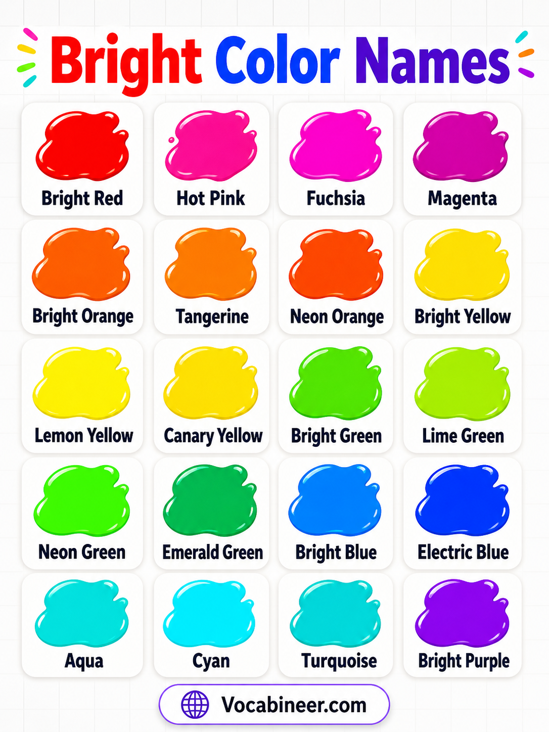
Bright Colors Chart
| Bright Color Name | Simple Description |
|---|---|
| Bright Red | A vivid red shade that looks bold and energetic. |
| Hot Pink | A vivid pink shade that looks bold and playful. |
| Fuchsia | A bright pink-purple shade. |
| Magenta | A strong pink-purple color with a vivid tone. |
| Bright Orange | A vivid orange shade that feels warm and energetic. |
| Tangerine | A fresh orange shade inspired by tangerines. |
| Neon Orange | A very intense orange shade that stands out strongly. |
| Bright Yellow | A clear yellow shade that feels sunny and cheerful. |
| Lemon Yellow | A fresh yellow shade inspired by lemons. |
| Canary Yellow | A vivid yellow shade inspired by canary birds. |
| Bright Green | A clear green shade that feels fresh and lively. |
| Lime Green | A vivid yellow-green shade inspired by limes. |
| Neon Green | A very intense green shade that looks electric. |
| Emerald Green | A jewel-like green shade with a vivid look. |
| Bright Blue | A clear blue shade that looks fresh and bold. |
| Electric Blue | A vivid blue shade with a bold modern look. |
| Aqua | A bright blue-green shade with a fresh look. |
| Cyan | A vivid color between blue and green. |
| Turquoise | A bright blue-green shade inspired by turquoise stone. |
| Bright Purple | A vivid purple shade with a strong look. |
Bright Red and Pink Shades
Red and pink bright shades feel bold, lively, and expressive. These colors often appear in flowers, fashion, posters, signs, toys, and eye-catching designs.
Bright Red
Bright red is a vivid red shade that looks strong and energetic. It is often used when a design needs quick attention.
Scarlet
Scarlet is a bright red shade with a lively look. It feels warm, bold, and eye-catching.
Cherry Red
Cherry red is a fresh red shade inspired by ripe cherries. It looks cheerful, playful, and clear.
Ruby Red
Ruby red is a jewel-like bright red shade. It feels rich, polished, and vivid.
Hot Pink
Hot pink is a vivid pink shade that looks bold and playful. It is common in fashion, party designs, beauty visuals, and fun graphics.
Fuchsia
Fuchsia is a bright pink-purple shade. It feels stylish, expressive, and energetic.
Magenta
Magenta is a strong pink-purple color with a vivid tone. It often looks modern, creative, and bold.
Coral Pink
Coral pink is a bright pink shade with warm coral tones. It feels fresh, friendly, and lively.
Bright Orange and Yellow Shades
Orange and yellow bright shades feel warm, sunny, and cheerful. They often remind us of fruit, flowers, sunshine, fire, and glowing light.
Bright Orange
Bright orange is a vivid orange shade that feels warm and energetic. It works well in cheerful, playful, and attention-grabbing designs.
Tangerine
Tangerine is a fresh orange shade inspired by tangerines. It looks juicy, lively, and fun.
Carrot Orange
Carrot orange is a clear orange shade inspired by carrots. It feels bright, natural, and fresh.
Sunset Orange
Sunset orange is a bright orange shade inspired by sunset colors. It feels warm, glowing, and cheerful.
Neon Orange
Neon orange is a very intense orange shade that stands out strongly. Therefore, it is often used in signs, sportswear, safety visuals, and bold graphics.
Bright Yellow
Bright yellow is a clear yellow shade that feels sunny and cheerful. It can make a design look happy, fresh, and energetic.
Lemon Yellow
Lemon yellow is a fresh yellow shade inspired by lemons. It feels sharp, clean, and lively.
Canary Yellow
Canary yellow is a vivid yellow shade inspired by canary birds. It looks bright, bold, and cheerful.
Bright Green Shades
Bright green shades feel fresh, lively, and full of movement. They are often linked with spring, plants, fruits, nature, and playful designs.
Bright Green
Bright green is a clear green shade that feels fresh and lively. It works well for nature, learning, and colorful visuals.
Lime Green
Lime green is a vivid yellow-green shade inspired by limes. It feels sharp, fresh, and energetic.
Neon Green
Neon green is a very intense green shade that looks electric. Because it is highly visible, it is useful for bold labels, signs, and sporty designs.
Spring Green
Spring green is a fresh green shade inspired by new leaves. It feels natural, bright, and cheerful.
Emerald Green
Emerald green is a jewel-like green shade with a vivid look. It feels rich, bright, and elegant.
Kelly Green
Kelly green is a strong, clear green shade. It looks bold, fresh, and classic.
Apple Green
Apple green is a bright green shade inspired by green apples. It feels clean, playful, and fresh.
Chartreuse
Chartreuse is a vivid yellow-green shade. It looks unusual, bright, and energetic.
Bright Blue and Teal Shades
Bright blue and teal shades feel fresh, clean, modern, and lively. These colors are common in sky themes, water designs, digital graphics, and modern branding.
Bright Blue
Bright blue is a clear blue shade that looks fresh and bold. It feels energetic while still looking clean.
Sky Blue
Sky blue is a light bright blue shade inspired by the sky. It feels open, cheerful, and fresh.
Electric Blue
Electric blue is a vivid blue shade with a bold modern look. It feels bright, digital, and energetic.
Cobalt Blue
Cobalt blue is a strong blue shade with rich brightness. It looks clear, deep, and eye-catching.
Azure
Azure is a bright blue shade inspired by clear sky. It feels clean, open, and fresh.
Aqua
Aqua is a bright blue-green shade with a fresh look. It often feels watery, clean, and lively.
Cyan
Cyan is a vivid color between blue and green. It looks bright, modern, and digital.
Turquoise
Turquoise is a bright blue-green shade inspired by turquoise stone. It feels fresh, tropical, and cheerful.
Bright Purple and Violet Shades
Bright purple and violet shades feel creative, stylish, and expressive. They often appear in flowers, art, fashion, beauty designs, and playful palettes.
Bright Purple
Bright purple is a vivid purple shade with a strong look. It feels creative, bold, and fun.
Violet
Violet is a bright blue-purple shade. It feels artistic, rich, and lively.
Amethyst
Amethyst is a jewel-like purple shade. It looks bright, elegant, and creative.
Orchid
Orchid is a bright pink-purple shade inspired by orchid flowers. It feels floral, stylish, and fresh.
Grape Purple
Grape purple is a vivid purple shade inspired by grapes. It looks bold, fruity, and playful.
Electric Purple
Electric purple is a strong purple shade with a bold, glowing look. It feels modern, creative, and dramatic.
Royal Purple
Royal purple is a rich bright purple shade with a bold feel. It looks elegant, vivid, and strong.
Lilac
Lilac is a light purple shade with a soft but clear look. It feels fresh, floral, and gentle.
Bright Colors vs Pastel Colors
Bright and pastel colors look very different. Vivid shades feel strong and easy to notice, while pastel shades look soft, pale, and gentle.
| Feature | Bright Colors | Pastel Colors |
|---|---|---|
| Appearance | Strong, clear, and vivid | Soft, pale, and gentle |
| Intensity | High intensity | Low intensity |
| Feeling | Energetic, playful, bold | Calm, cute, peaceful |
| Examples | Hot pink, neon green, electric blue | Baby pink, mint green, lavender |
| Common Use | Posters, signs, toys, bold graphics | Baby themes, soft designs, calm visuals |
How to Use Bright Colors in Design
Bright colors work well when you want a design to feel cheerful, energetic, playful, or bold. They are useful for posters, classroom visuals, toys, games, sports graphics, social media designs, and attention-grabbing labels.
For bold and expressive designs, use bright red, hot pink, and magenta. Orange and yellow shades are great for sunny, cheerful, and friendly visuals. Meanwhile, green, blue, teal, and purple shades can make designs look fresh, creative, modern, or exciting.
FAQs
Bright colors are clear, vivid colors that look strong and easy to notice. They usually have high intensity and feel energetic, cheerful, bold, or playful.
Examples of bright colors include bright red, scarlet, hot pink, fuchsia, bright orange, lemon yellow, lime green, neon green, electric blue, cyan, turquoise, violet, and bright purple.
Yes, neon green is a bright color. It is very intense and highly visible, so it is often used in bold designs, signs, sportswear, and attention-grabbing visuals.
Bright colors are strong, vivid, and high in intensity. Pastel colors are soft, pale, and gentle. For example, hot pink is bright, while baby pink is pastel.
Common bright colors include bright red, orange, yellow, lime green, neon green, bright blue, electric blue, hot pink, magenta, turquoise, and bright purple.
Summary
Bright color names include vivid red, pink, orange, yellow, green, blue, teal, purple, and violet shades. Common bright colors include bright red, hot pink, fuchsia, bright orange, lemon yellow, lime green, neon green, electric blue, cyan, turquoise, violet, and royal purple. Learning bright color names helps you understand color charts, palettes, designs, and visual examples more clearly.
Read More
- Colours Names in English
- Gold Colored Things Names
- Types of Dark Colors
- Types of Warm Colors
- Light Color Names
- Types of Cool Colors