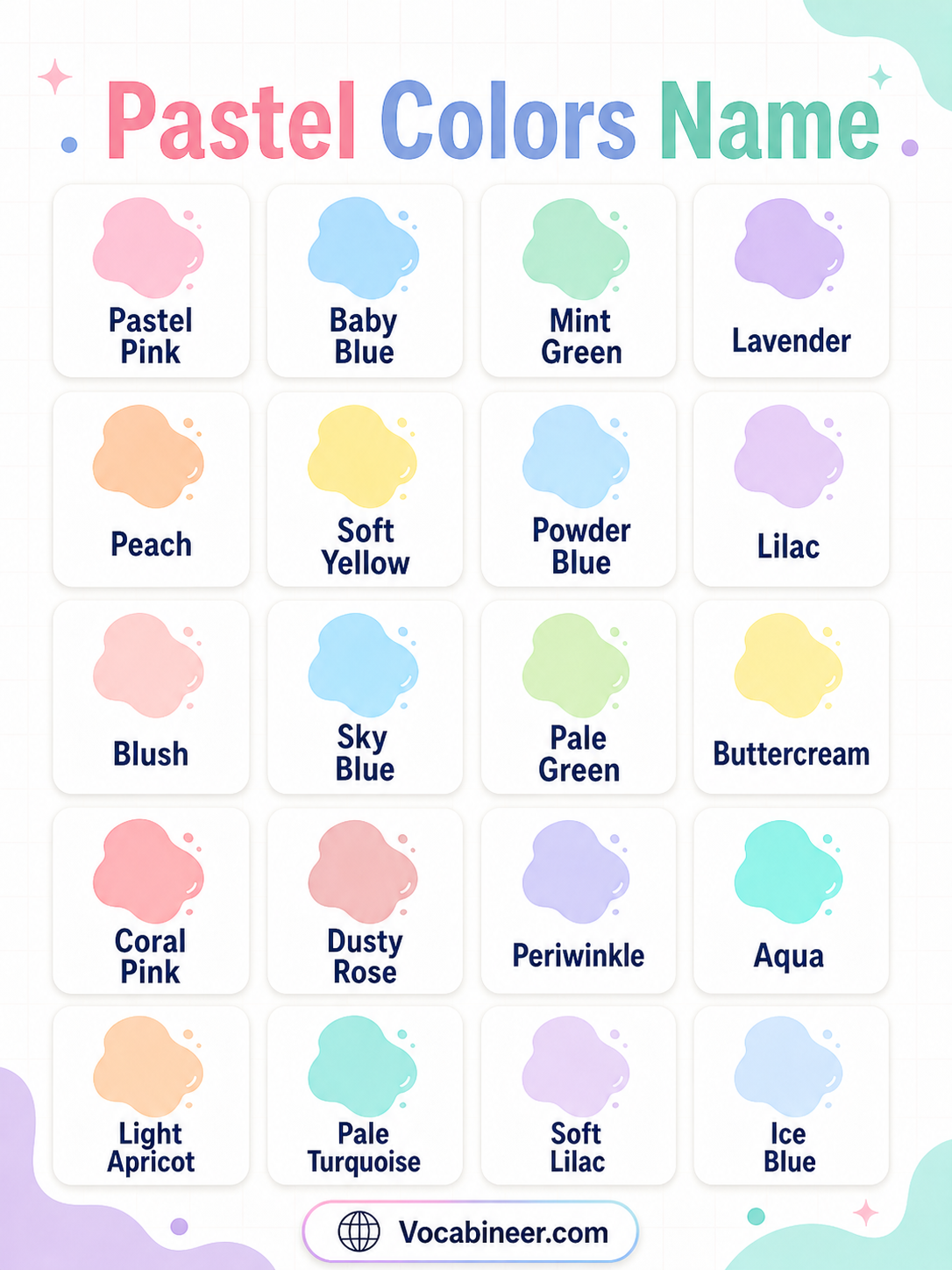
Pastel colors are soft, light shades that look gentle and calm. They often include pale pink, baby blue, mint green, lavender, peach, cream, pastel yellow, and other smooth colors with a light, airy feel.
This guide explains 50 pastel color names with simple descriptions and picture-friendly groups. You will learn pink pastel shades, blue pastel shades, green pastel shades, purple pastel tones, yellow shades, orange shades, and soft neutral pastel colors.
In This Page
What Are Pastel Colors?
Pastel colors are light colors with a soft and gentle appearance. They usually look less strong than bright colors because they are pale, smooth, and low in intensity.
These colors are common in art, fashion, room decor, baby themes, spring designs, invitations, branding, and educational visuals. Pastel colors can make a design feel calm, cute, fresh, soft, or peaceful.
Pastel Colors Chart
| Pastel Color Name | Simple Description |
|---|---|
| Pastel Pink | A soft light pink shade with a gentle look. |
| Baby Pink | A very light pink shade often used in soft designs. |
| Blush Pink | A pale pink shade with a warm, delicate tone. |
| Rose Pink | A soft pink shade inspired by rose petals. |
| Pastel Blue | A soft light blue shade. |
| Baby Blue | A pale blue shade with a gentle look. |
| Powder Blue | A soft muted blue shade. |
| Sky Blue | A light blue shade inspired by the sky. |
| Pastel Green | A soft light green shade. |
| Mint Green | A fresh pale green shade. |
| Sage Green | A muted gray-green shade with a calm feel. |
| Seafoam Green | A soft blue-green shade inspired by sea foam. |
| Pastel Purple | A soft light purple shade. |
| Lavender | A pale purple shade inspired by lavender flowers. |
| Lilac | A light purple shade with a floral look. |
| Pastel Yellow | A soft light yellow shade. |
| Butter Yellow | A creamy yellow shade with a gentle look. |
| Peach | A soft orange-pink shade. |
| Cream | A warm off-white shade. |
| Pastel Beige | A light beige shade with a soft warm tone. |
Pink and Red Pastel Shades
Pink and red pastel shades feel soft, sweet, warm, and gentle. They are common in flowers, baby themes, fashion, invitations, beauty designs, and cute visual palettes.
Pastel Pink
Pastel pink is a soft light pink shade. It feels gentle, sweet, and calm.
Baby Pink
Baby pink is a very light pink shade. It is often used in baby themes, soft designs, and cute illustrations.
Blush Pink
Blush pink is a pale pink shade with a warm and delicate tone. It often feels romantic and elegant.
Rose Pink
Rose pink is a soft pink shade inspired by rose petals. It looks gentle, floral, and pretty.
Dusty Rose
Dusty rose is a muted pink shade with a slightly gray tone. It feels soft, calm, and vintage.
Salmon Pink
Salmon pink is a warm pink-orange shade. It has a soft, fresh, and slightly peachy look.
Pastel Red
Pastel red is a lighter and softer version of red. It keeps some warmth but looks much gentler than bright red.
Coral Pink
Coral pink is a soft pink shade mixed with coral warmth. It feels fresh, lively, and friendly.
Watermelon Pink
Watermelon pink is a fresh pink shade inspired by watermelon flesh. It looks bright but still soft enough for pastel palettes.
Cherry Blossom Pink
Cherry blossom pink is a pale pink shade inspired by cherry blossoms. It feels delicate, floral, and peaceful.
Blue Pastel Shades
Blue pastel shades feel calm, airy, fresh, and clean. They often remind us of sky, water, ice, clouds, and soft peaceful backgrounds.
Pastel Blue
Pastel blue is a soft light blue shade. It feels calm, peaceful, and gentle.
Baby Blue
Baby blue is a pale blue shade with a gentle look. It is common in soft designs, baby themes, and sky-inspired palettes.
Powder Blue
Powder blue is a soft muted blue shade. It feels smooth, light, and slightly vintage.
Sky Blue
Sky blue is a light blue shade inspired by the sky. It looks fresh, open, and cheerful.
Ice Blue
Ice blue is a very pale blue shade with a cool feel. It looks crisp, clean, and soft.
Misty Blue
Misty blue is a pale blue-gray shade with a soft look. It feels calm, foggy, and gentle.
Dusty Blue
Dusty blue is a muted blue shade with a grayish tone. It feels soft, calm, and elegant.
Periwinkle Blue
Periwinkle blue is a soft mix of blue and violet. It looks dreamy, gentle, and cool.
Light Cyan
Light cyan is a very light blue-green shade. It feels clean, fresh, and bright.
Pale Turquoise
Pale turquoise is a soft blue-green shade with a light tone. It feels fresh, watery, and calm.
Green Pastel Shades
Green pastel shades feel fresh, natural, soft, and peaceful. They are common in spring designs, plant themes, wellness visuals, and calm color palettes.
Pastel Green
Pastel green is a soft light green shade. It feels fresh, calm, and natural.
Mint Green
Mint green is a fresh pale green shade. It looks clean, soft, and refreshing.
Pale Green
Pale green is a very light green shade. It feels gentle, airy, and natural.
Sage Green
Sage green is a muted gray-green shade with a calm feel. It looks natural, soft, and balanced.
Seafoam Green
Seafoam green is a soft blue-green shade inspired by sea foam. It feels fresh, light, and relaxing.
Tea Green
Tea green is a very pale green shade with a fresh look. It feels clean, soft, and peaceful.
Pistachio Green
Pistachio green is a soft yellow-green shade inspired by pistachios. It feels warm, fresh, and natural.
Aqua Green
Aqua green is a light green shade mixed with blue. It looks fresh, watery, and bright.
Eucalyptus Green
Eucalyptus green is a soft muted green shade inspired by eucalyptus leaves. It feels natural, calm, and modern.
Celadon Green
Celadon green is a pale gray-green shade with a soft finish. It feels delicate, calm, and elegant.
Purple and Violet Pastel Shades
Purple and violet pastel shades feel dreamy, calm, creative, and gentle. They are common in floral designs, soft branding, spring palettes, and aesthetic visuals.
Pastel Purple
Pastel purple is a soft light purple shade. It feels calm, dreamy, and gentle.
Lavender
Lavender is a pale purple shade inspired by lavender flowers. It feels soft, relaxing, and floral.
Lilac
Lilac is a light purple shade with a floral look. It feels fresh, gentle, and pretty.
Mauve
Mauve is a soft muted purple-pink shade. It feels calm, dusty, and elegant.
Wisteria
Wisteria is a light violet shade inspired by wisteria flowers. It looks soft, floral, and dreamy.
Pale Violet
Pale violet is a light violet shade with a gentle tone. It feels soft and peaceful.
Orchid Pink
Orchid pink is a soft pink-purple shade inspired by orchids. It feels floral, delicate, and bright.
Heather Purple
Heather purple is a muted purple shade with a soft natural look. It feels calm and earthy.
Light Periwinkle
Light periwinkle is a pale blue-violet shade. It feels cool, soft, and dreamy.
Dusty Lavender
Dusty lavender is a muted lavender shade with a dusty tone. It feels gentle, calm, and vintage.
Yellow, Orange, and Neutral Pastel Shades
Yellow, orange, and neutral pastel shades feel warm, light, creamy, and cheerful. They are useful for soft backgrounds, baby designs, spring themes, and gentle color palettes.
Pastel Yellow
Pastel yellow is a soft light yellow shade. It feels sunny, cheerful, and gentle.
Butter Yellow
Butter yellow is a creamy yellow shade with a gentle look. It feels warm, soft, and pleasant.
Lemon Chiffon
Lemon chiffon is a pale yellow shade with a soft finish. It looks light, creamy, and fresh.
Vanilla
Vanilla is a creamy pale yellow-white shade. It feels soft, warm, and smooth.
Cream
Cream is a warm off-white shade. It feels gentle, clean, and comfortable.
Peach
Peach is a soft orange-pink shade. It feels warm, friendly, and fresh.
Apricot
Apricot is a pale orange-peach shade. It looks soft, warm, and natural.
Pastel Orange
Pastel orange is a softer and lighter orange shade. It feels cheerful without looking too strong.
Champagne
Champagne is a soft beige-gold shade. It feels elegant, warm, and light.
Pastel Beige
Pastel beige is a light beige shade with a soft warm tone. It feels calm, natural, and simple.
Pastel Colors vs Bright Colors
Pastel and bright colors have different visual effects. Pastel colors look soft, pale, and gentle, while bright colors look stronger, clearer, and more intense.
| Feature | Pastel Colors | Bright Colors |
|---|---|---|
| Appearance | Soft, pale, and gentle | Strong, clear, and vivid |
| Intensity | Low intensity | High intensity |
| Feeling | Calm, cute, airy, peaceful | Bold, energetic, playful, loud |
| Examples | Baby pink, mint green, lavender | Hot pink, bright green, electric blue |
| Common Use | Soft designs, baby themes, calm visuals | Attention, posters, bold branding |
How to Use Pastel Colors in Design
Pastel colors work well when you want a design to feel soft, calm, cute, fresh, or friendly. They are often used in educational graphics, baby products, spring designs, wedding themes, beauty branding, stationery, and social media visuals.
Use pastel pink, lavender, baby blue, and mint green for gentle and dreamy designs. Peach, cream, butter yellow, and pastel beige work well for warm, soft backgrounds. Pastel blue, seafoam green, and pale turquoise can create a clean and refreshing look.
FAQs
Pastel colors are soft, light colors with a gentle appearance. They usually look pale and low in intensity, such as pastel pink, baby blue, mint green, lavender, peach, cream, and pastel yellow.
Examples of pastel colors include pastel pink, baby pink, blush pink, baby blue, powder blue, mint green, sage green, lavender, lilac, pastel yellow, peach, apricot, cream, and pastel beige.
Yes, pastel pink is a pastel color. It is a soft, light pink shade that looks gentle and calm.
Pastel colors look soft, pale, and gentle, while bright colors look strong, vivid, and intense. For example, baby pink is pastel, but hot pink is bright.
The most common pastel colors include pastel pink, baby blue, mint green, lavender, lilac, peach, cream, butter yellow, sage green, and pastel beige.
Summary
Pastel colors are soft, light shades with a gentle and calm look. Common pastel color names include pastel pink, baby pink, blush pink, pastel blue, baby blue, mint green, sage green, lavender, lilac, pastel yellow, peach, apricot, cream, and pastel beige. Learning pastel color names helps you understand soft color palettes, design ideas, and visual examples more clearly.
Read More
- Colours Names in English
- Gold Colored Things Names
- Types of Dark Colors
- Types of Warm Colors
- Light Color Names
- Types of Cool Colors