Soft colors are gentle shades that feel light, calm, and easy on the eyes. They include colors such as blush pink, powder blue, sage green, cream, lavender, peach, ivory, beige, and warm gray. These colors often appear in interior design, fashion, beauty, weddings, branding, websites, packaging, and art.
Learning soft color names helps readers describe colors more clearly in English. It also helps designers, students, decorators, artists, and style learners choose better color combinations. Because soft colors look less intense than bright colors, they can create a peaceful, elegant, romantic, fresh, or cozy look.
In This Page
What Are Soft Colors?
Soft colors are colors with a gentle, low-intensity appearance. They may look pale, muted, creamy, dusty, light, or slightly gray-toned. Many soft colors contain white, gray, beige, or a lower level of saturation, which makes them look calmer than bold shades.
For example, baby pink looks softer than hot pink, and powder blue feels gentler than royal blue. Similarly, sage green looks calmer than bright green because it has a muted, gray-green tone.
Soft colors can include:
- Pale colors
- Pastel colors
- Muted colors
- Dusty colors
- Creamy colors
- Soft neutrals
- Light warm shades
- Gentle cool shades
Quick Chart of Soft Color Names
| Soft Color Name | Color Family | Simple Meaning | Common Use |
|---|---|---|---|
| Blush Pink | Pink | Soft pale pink | Weddings, makeup, fashion |
| Baby Pink | Pink | Light gentle pink | Kids’ items, clothing, decor |
| Dusty Rose | Pink | Muted rose pink | Interiors, fashion, flowers |
| Pale Peach | Orange | Light peach shade | Beauty, weddings, branding |
| Cream | Neutral | Soft warm white | Interiors, clothing, decor |
| Ivory | Neutral | Warm off-white | Weddings, luxury design |
| Butter Yellow | Yellow | Soft pale yellow | Kitchens, nurseries, spring themes |
| Mint Green | Green | Light fresh green | Decor, fashion, packaging |
| Sage Green | Green | Muted gray-green | Interiors, branding, clothing |
| Seafoam Green | Green | Soft blue-green | Bathrooms, beach themes |
| Powder Blue | Blue | Soft pale blue | Bedrooms, fashion, websites |
| Baby Blue | Blue | Light gentle blue | Kids’ rooms, clothing, stationery |
| Lavender | Purple | Soft pale purple | Beauty, weddings, decor |
| Lilac | Purple | Light purple-pink shade | Fashion, flowers, design |
| Mauve | Purple | Muted purple-pink | Makeup, interiors, outfits |
| Beige | Neutral | Light brown neutral | Homes, fashion, furniture |
| Taupe | Neutral | Brown-gray neutral | Interiors, handbags, shoes |
| Champagne | Neutral | Soft golden beige | Weddings, luxury packaging |
| Warm Gray | Neutral | Soft gray with warmth | Interiors, websites, branding |
| Pearl White | Neutral | Soft white with a refined look | Weddings, decor, luxury style |
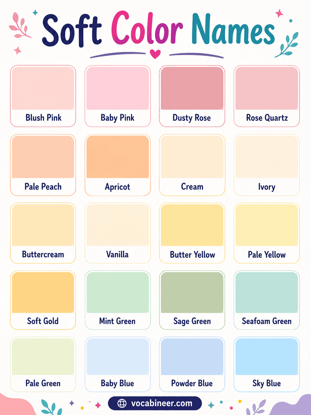
Common Soft Color Names with Pictures
Pictures help learners recognize soft colors by their gentle tone, lightness, warmth, and mood.
Blush Pink
Blush pink is a soft pale pink that feels gentle and romantic. It works well in weddings, makeup, fashion, and bedroom decor.
Baby Pink
Baby pink is a very light pink shade. It often appears in kids’ items, clothing, stationery, and soft decorative themes.
Dusty Rose
Dusty rose is a muted rose-pink shade with a calm, elegant look. It suits flowers, interiors, fashion, and vintage designs.
Rose Quartz
Rose quartz is a delicate pink shade inspired by the gemstone. It gives designs a soft, graceful, and polished feel.
Pale Peach
Pale peach is a light peach shade with soft warmth. It feels friendly, fresh, and natural without looking too bright.
Apricot
Apricot is a gentle orange shade with a warm fruit-like tone. It works well in spring fashion, beauty products, and cheerful decor.
Cream
Cream is a warm off-white color. It looks softer than pure white and suits interiors, clothing, furniture, and elegant designs.
Ivory
Ivory is a soft white shade with a warm tone. It often appears in weddings, luxury decor, classic interiors, and formal clothing.
Butter Yellow
Butter yellow is a pale yellow shade with a soft cheerful look. It works well in kitchens, nurseries, spring themes, and light decor.
Mint Green
Mint green is a light green shade with a fresh feel. It suits packaging, bathrooms, clothing, and clean website designs.
Sage Green
Sage green is a muted gray-green shade. It feels calm, natural, and stylish, especially in interiors, branding, and fashion.
Seafoam Green
Seafoam green is a soft blue-green color. It often gives rooms, packaging, and beach themes a fresh and airy look.
Baby Blue
Baby blue is a very light blue shade. It feels clean, gentle, and peaceful in clothing, kids’ rooms, stationery, and decor.
Powder Blue
Powder blue is a soft pale blue with a calm appearance. Designers often use it in bedrooms, websites, fashion, and invitations.
Sky Blue
Sky blue is a light fresh blue inspired by a clear sky. It creates an open, airy, and relaxed feeling.
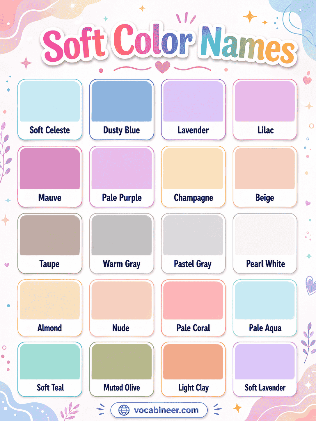
Lavender
Lavender is a soft pale purple. It often feels calm, delicate, and graceful in beauty products, bedrooms, weddings, and flowers.
Lilac
Lilac is a light purple shade with a soft pink touch. It suits spring designs, dresses, floral themes, and packaging.
Mauve
Mauve is a muted purple-pink color. It works well in makeup, outfits, interiors, and elegant color palettes.
Champagne
Champagne is a soft beige-gold shade. It often feels warm, refined, and luxurious in weddings, packaging, and decor.
Beige
Beige is a light brown neutral shade. It creates a simple, warm, and balanced look in homes, fashion, furniture, and accessories.
Taupe
Taupe is a soft gray-brown color. It adds depth while still looking calm and neutral.
Warm Gray
Warm gray is a soft gray with beige or brown undertones. It feels modern, balanced, and comfortable in interiors and branding.
Pearl White
Pearl white is a soft white shade with a smooth, polished look. It suits weddings, luxury packaging, clean decor, and elegant designs.
Pale Coral
Pale coral is a soft pink-orange shade. It feels warm, lively, and fresh without looking too bold.
Soft Teal
Soft teal is a muted blue-green color. It gives designs a calm, modern, and slightly rich appearance.
Soft Color Names with Simple Meanings
| Soft Color Name | Simple Meaning |
|---|---|
| Blush Pink | A pale pink shade with a romantic look |
| Baby Pink | A very light and gentle pink |
| Dusty Rose | A muted rose-pink shade |
| Rose Quartz | A soft gemstone-inspired pink |
| Pale Peach | A light peach shade |
| Apricot | A soft orange shade |
| Cream | A warm off-white color |
| Ivory | A soft white with warmth |
| Buttercream | A creamy pale yellow |
| Vanilla | A pale cream shade |
| Butter Yellow | A soft warm yellow |
| Pale Yellow | A light gentle yellow |
| Soft Gold | A muted golden shade |
| Mint Green | A light fresh green |
| Sage Green | A muted gray-green |
| Seafoam Green | A soft blue-green |
| Pale Green | A light green shade |
| Baby Blue | A very light blue |
| Powder Blue | A soft pale blue |
| Sky Blue | A light fresh blue |
| Soft Celeste | A pale blue-green shade |
| Dusty Blue | A muted gray-blue |
| Lavender | A soft pale purple |
| Lilac | A light purple-pink shade |
| Mauve | A muted purple-pink |
| Pale Purple | A light soft purple |
| Champagne | A soft beige-gold |
| Beige | A light brown neutral |
| Taupe | A soft gray-brown |
| Warm Gray | A soft warm gray |
| Pastel Gray | A light gentle gray |
| Pearl White | A soft polished white |
| Almond | A warm beige shade |
| Nude | A soft beige-pink neutral |
| Pale Coral | A soft coral shade |
| Pale Aqua | A light blue-green |
| Soft Teal | A muted teal shade |
| Muted Olive | A soft olive green |
| Light Clay | A warm earthy soft shade |
Soft Colors by Color Family
Grouping soft colors by family makes them easier to learn. This layout also helps readers choose shades for rooms, outfits, makeup, websites, and designs.
Soft Pink Colors
Soft pink colors often feel gentle, romantic, and warm. They are common in weddings, makeup, flowers, fashion, and bedroom decor.
| Color Name | Look and Feel | Common Use |
|---|---|---|
| Baby Pink | Light and sweet | Kids’ items, stationery, clothing |
| Blush Pink | Gentle and romantic | Weddings, makeup, decor |
| Dusty Rose | Muted and elegant | Fashion, flowers, interiors |
| Rose Quartz | Delicate and polished | Jewelry branding, beauty, decor |
| Powder Pink | Pale and soft | Dresses, packaging, accessories |
| Misty Rose | Light pink with warmth | Bedrooms, flowers, wedding themes |
Soft Blue Colors
Soft blue colors usually feel calm, clean, and fresh. Designers often use them in bedrooms, websites, stationery, and peaceful spaces.
| Color Name | Look and Feel | Common Use |
|---|---|---|
| Baby Blue | Gentle and clean | Kids’ rooms, clothes, cards |
| Powder Blue | Calm and airy | Bedrooms, websites, stationery |
| Sky Blue | Fresh and open | Travel, nature, fashion |
| Dusty Blue | Muted and elegant | Weddings, interiors, branding |
| Soft Celeste | Light and modern | Decor, websites, packaging |
| Pale Aqua | Fresh and watery | Bathrooms, beach themes, wellness |
Soft Green Colors
Soft green colors create a natural, balanced, and refreshing look. They work well in interiors, wellness themes, packaging, and fashion.
| Color Name | Look and Feel | Common Use |
|---|---|---|
| Mint Green | Fresh and light | Packaging, bathrooms, clothing |
| Sage Green | Calm and natural | Interiors, fashion, branding |
| Seafoam Green | Airy and coastal | Beach themes, bathrooms, decor |
| Pale Green | Gentle and clean | Wellness, nature themes, websites |
| Pale Sage | Soft and earthy | Bedrooms, kitchens, outfits |
| Muted Olive | Natural and grounded | Fashion, interiors, outdoor themes |
Soft Yellow and Cream Colors
Soft yellow and cream colors feel warm, light, and welcoming. They are useful for kitchens, nurseries, spring themes, and cozy interiors.
| Color Name | Look and Feel | Common Use |
|---|---|---|
| Cream | Warm and soft | Interiors, clothing, furniture |
| Ivory | Classic and elegant | Weddings, decor, luxury design |
| Buttercream | Sweet and warm | Kitchens, nurseries, dessert brands |
| Vanilla | Simple and clean | Minimal design, packaging, decor |
| Butter Yellow | Cheerful and soft | Spring themes, kitchens, kids’ rooms |
| Pale Yellow | Light and sunny | Stationery, decor, children’s designs |
| Soft Gold | Warm and refined | Luxury branding, weddings, accents |
Soft Purple Colors
Soft purple colors often look delicate, dreamy, and graceful. They suit beauty products, flowers, bedrooms, outfits, and wedding themes.
| Color Name | Look and Feel | Common Use |
|---|---|---|
| Lavender | Calm and delicate | Beauty, bedrooms, weddings |
| Lilac | Fresh and floral | Fashion, flowers, spring themes |
| Mauve | Muted and elegant | Makeup, clothing, interiors |
| Pale Purple | Soft and dreamy | Kids’ rooms, art, decor |
| Soft Lavender | Gentle and soothing | Wellness, candles, beauty products |
| Pale Lilac | Light and floral | Dresses, invitations, packaging |
Soft Neutral Colors
Soft neutral colors are calm, simple, and easy to match. They are popular in homes, fashion, websites, furniture, and luxury designs.
| Color Name | Look and Feel | Common Use |
|---|---|---|
| Beige | Warm and simple | Interiors, fashion, furniture |
| Taupe | Soft and balanced | Home decor, shoes, handbags |
| Warm Gray | Calm and modern | Websites, interiors, offices |
| Pastel Gray | Light and clean | Minimal design, backgrounds |
| Pearl White | Elegant and smooth | Weddings, luxury decor, packaging |
| Almond | Natural and cozy | Interiors, clothing, branding |
| Nude | Soft and understated | Makeup, fashion, accessories |
| Light Clay | Earthy and warm | Decor, pottery, lifestyle branding |
Soft Colors with Hex Codes
Hex codes help designers use exact colors in websites, graphics, branding, and digital art. However, color appearance may change slightly on different screens.
| Soft Color Name | Hex Code |
|---|---|
| Blush Pink | #F4C2C2 |
| Baby Pink | #F4C2D7 |
| Dusty Rose | #C9A0A0 |
| Rose Quartz | #F7CAC9 |
| Pale Peach | #FFE5B4 |
| Apricot | #FBCEB1 |
| Cream | #FFFDD0 |
| Ivory | #FFFFF0 |
| Buttercream | #F6E6B4 |
| Vanilla | #F3E5AB |
| Butter Yellow | #FFF4B8 |
| Pale Yellow | #FFFFBF |
| Mint Green | #98FF98 |
| Sage Green | #B2AC88 |
| Seafoam Green | #93E9BE |
| Pale Green | #C7F6C7 |
| Baby Blue | #89CFF0 |
| Powder Blue | #B0E0E6 |
| Sky Blue | #87CEEB |
| Dusty Blue | #8DA9C4 |
| Lavender | #E6E6FA |
| Lilac | #C8A2C8 |
| Mauve | #E0B0FF |
| Champagne | #F7E7CE |
| Beige | #F5F5DC |
| Taupe | #B38B6D |
| Warm Gray | #BEB7A4 |
| Pearl White | #F8F6F0 |
| Pale Coral | #F7B6A6 |
| Soft Teal | #8FCFC1 |
Soft Color Meanings and Mood
Soft colors can create different feelings depending on their family, brightness, and context. However, color meaning can vary by culture, design style, and personal preference.
| Soft Color Family | Common Mood | Examples |
|---|---|---|
| Soft pinks | Gentle, romantic, sweet | Blush pink, baby pink, dusty rose |
| Soft blues | Calm, fresh, peaceful | Powder blue, baby blue, dusty blue |
| Soft greens | Natural, balanced, fresh | Sage green, mint green, seafoam |
| Soft yellows | Warm, cheerful, light | Butter yellow, cream, vanilla |
| Soft purples | Delicate, dreamy, graceful | Lavender, lilac, mauve |
| Soft neutrals | Elegant, cozy, simple | Beige, ivory, taupe, warm gray |
| Soft earthy colors | Warm, grounded, natural | Light clay, almond, muted olive |
Soft Color Palettes and Combinations
Soft color palettes work well when the colors support each other without becoming too dull. A good palette usually combines a main soft color, a neutral color, and one accent shade.
| Palette Name | Color Combination | Best Use |
|---|---|---|
| Blush and Cream | Blush pink, cream, warm gray | Bedrooms, weddings, beauty branding |
| Sage and Ivory | Sage green, ivory, beige | Interiors, wellness, lifestyle brands |
| Powder Blue and White | Powder blue, pearl white, pastel gray | Bathrooms, websites, stationery |
| Peach and Champagne | Pale peach, champagne, ivory | Weddings, packaging, invitations |
| Lavender and Taupe | Lavender, taupe, cream | Bedrooms, fashion, beauty products |
| Mint and Soft Gold | Mint green, soft gold, ivory | Fresh branding, spring designs |
| Dusty Blue and Beige | Dusty blue, beige, warm gray | Wedding decor, home interiors |
| Mauve and Almond | Mauve, almond, cream | Makeup, clothing, soft branding |
| Seafoam and Sand | Seafoam green, beige, pearl white | Coastal decor, travel branding |
| Light Clay and Sage | Light clay, sage green, ivory | Earthy interiors, handmade brands |
Soft Colors by Use
Soft colors work in many visual fields because they look calm, refined, and easy to combine. Still, the best color choice depends on purpose, lighting, material, and audience.
Soft Colors for Interior Design
Soft colors often make rooms feel calm and open. They work especially well in bedrooms, living rooms, nurseries, kitchens, bathrooms, and small spaces.
| Space | Good Soft Colors | Why They Work |
|---|---|---|
| Bedroom | Powder blue, lavender, sage green | They create a calm look |
| Living room | Beige, taupe, warm gray, ivory | They feel cozy and balanced |
| Kitchen | Cream, butter yellow, sage green | They look warm and fresh |
| Bathroom | Seafoam green, pale aqua, pearl white | They feel clean and airy |
| Nursery | Baby pink, baby blue, mint green | They look gentle and playful |
| Home office | Warm gray, dusty blue, soft beige | They reduce visual harshness |
Soft Colors for Fashion and Style
Soft colors can make outfits look gentle, polished, or elegant. They also combine well with neutrals such as white, beige, gray, tan, and soft brown.
| Style Goal | Soft Colors to Try |
|---|---|
| Romantic look | Blush pink, dusty rose, champagne |
| Clean casual look | Powder blue, cream, beige |
| Natural style | Sage green, almond, muted olive |
| Elegant outfit | Taupe, ivory, mauve |
| Spring style | Lilac, mint green, pale yellow |
| Warm soft look | Pale peach, light clay, buttercream |
Soft Colors for Makeup and Beauty
Soft colors often appear in makeup because they can create a gentle and blended look. However, makeup shades can look different depending on lighting, undertone, and product texture.
| Beauty Use | Soft Colors |
|---|---|
| Lip colors | Nude, dusty rose, mauve, pale coral |
| Blush | Blush pink, peach, rose quartz |
| Eyeshadow | Champagne, taupe, lavender, warm gray |
| Nail colors | Baby pink, ivory, lilac, soft beige |
| Packaging | Pearl white, pale peach, sage green, powder blue |
Soft Colors for Weddings
Soft colors suit weddings because they often feel romantic, elegant, and graceful. Many wedding palettes combine soft colors with white, ivory, gold, greenery, or muted neutrals.
| Wedding Style | Soft Color Palette |
|---|---|
| Romantic wedding | Blush pink, ivory, champagne |
| Garden wedding | Sage green, cream, dusty rose |
| Beach wedding | Seafoam green, pearl white, beige |
| Spring wedding | Lilac, pale yellow, mint green |
| Elegant wedding | Mauve, taupe, ivory |
| Minimal wedding | Pearl white, warm gray, soft beige |
Soft Colors for Branding and Websites
Soft colors can help brands look calm, friendly, modern, or premium. They work well for wellness brands, beauty products, home decor, lifestyle blogs, wedding businesses, stationery, and handmade products.
| Brand Style | Soft Colors |
|---|---|
| Wellness | Sage green, pale aqua, ivory |
| Beauty | Blush pink, nude, champagne |
| Luxury | Pearl white, taupe, soft gold |
| Handmade | Light clay, almond, cream |
| Baby brand | Baby pink, baby blue, mint green |
| Minimal website | Warm gray, ivory, beige |
Warm Soft Colors and Cool Soft Colors
Soft colors can feel warm or cool. Warm soft colors often include peach, cream, yellow, beige, and clay tones. Cool soft colors often include blue, green, purple, and gray-toned shades.
| Type | Soft Color Names | Common Feeling |
|---|---|---|
| Warm soft colors | Pale peach, cream, ivory, butter yellow, champagne, light clay | Cozy, sunny, welcoming |
| Cool soft colors | Powder blue, sage green, lavender, seafoam green, dusty blue | Calm, fresh, peaceful |
| Soft neutrals | Beige, taupe, warm gray, pearl white, almond | Balanced, elegant, simple |
| Soft earthy colors | Muted olive, light clay, almond, sage green | Natural, grounded, warm |
Common Soft Color Differences
Some color terms sound similar, but they do not always mean the same thing. This table explains the most common differences.
| Comparison | Main Difference |
|---|---|
| Soft colors vs pastel colors | Pastels are usually pale and light, while soft colors can also be muted, dusty, creamy, or gray-toned. |
| Soft colors vs muted colors | Muted colors have reduced intensity, while soft colors may be pale, gentle, creamy, or muted. |
| Soft colors vs neutral colors | Neutral colors include beige, ivory, taupe, gray, and cream, while soft colors can also include gentle pinks, blues, greens, yellows, and purples. |
| Warm soft colors vs cool soft colors | Warm soft colors include peach, cream, and butter yellow, while cool soft colors include powder blue, sage, and lavender. |
| Soft colors vs bright colors | Soft colors look gentle and low-intensity, while bright colors look bold, strong, and attention-grabbing. |
| Pale colors vs dusty colors | Pale colors look light, while dusty colors look muted or slightly gray-toned. |
| Nude vs beige | Nude often has a soft skin-like or pink-beige tone, while beige is a broader light brown neutral. |
Terms Often Confused with Soft Colors
| Term | Meaning |
|---|---|
| Pastel | A pale color, often made lighter with white |
| Muted | A color with reduced intensity or grayness |
| Neutral | A color such as white, cream, beige, gray, taupe, or brown |
| Pale | A very light version of a color |
| Dusty | A muted color with a soft gray or brown tone |
| Nude | A soft beige, pink-beige, or skin-like neutral shade |
| Light | A color that has more brightness or white |
| Desaturated | A color with lower intensity |
| Creamy | A soft warm shade with a smooth off-white or yellowish tone |
| Earthy | A natural-looking color inspired by soil, clay, plants, or stone |
Tips for Using Soft Colors
Soft colors work best when they have enough contrast, texture, and balance. Otherwise, a design may look too pale or washed out.
| Tip | Why It Helps |
|---|---|
| Add a neutral base | Ivory, cream, beige, or gray can balance soft colors |
| Use one stronger accent | A deeper green, brown, navy, or gold can add contrast |
| Mix textures | Fabric, wood, stone, metal, and glass keep soft palettes interesting |
| Check lighting | Colors may look different in natural and artificial light |
| Avoid too many pale shades together | Too many light colors can look flat |
| Pair warm and cool tones carefully | Balance peach with sage, or cream with powder blue |
| Use soft colors for backgrounds | They work well behind text, photos, and products |
| Keep readability in mind | Very pale colors may need darker text |
Example Sentences with Soft Color Names
- Blush pink gives the room a gentle and romantic look.
- Sage green looks calm and natural in a bedroom.
- Powder blue can make a website feel clean and peaceful.
- Ivory curtains soften the sunlight in the living room.
- The bride chose a champagne dress for an elegant style.
- Mint green packaging feels fresh and modern.
- Dusty rose flowers matched the wedding theme.
- Taupe shoes can pair well with many soft outfits.
- Lavender candles created a relaxing mood.
- Cream walls made the small room look brighter.
- Pale peach looks warm without feeling too bold.
- Soft teal adds color while keeping the design calm.
- Warm gray works well as a soft background color.
- Lilac dresses looked fresh for the spring event.
- Pearl white details gave the design a polished finish.
Common Mistakes with Soft Color Names
| Mistake | Correct Information |
|---|---|
| Soft colors and pastel colors always mean the same thing | Pastels are usually pale, while soft colors can also be muted, dusty, creamy, or gray-toned |
| All soft colors are light | Many are light, but some soft colors look muted rather than very pale |
| Neutral colors cannot be soft colors | Cream, ivory, beige, taupe, and warm gray can be soft neutrals |
| Soft colors always look feminine | Soft colors can look elegant, modern, natural, minimal, or professional depending on use |
| Pale colors always work well together | Too many pale colors can look flat without contrast |
| Soft colors do not need contrast | Soft palettes still need darker text, accents, or texture |
| Beige and nude are always the same | Nude often has a skin-like or pink-beige tone, while beige is a broader neutral |
| Bright colors cannot pair with soft colors | A small bright accent can work well with a soft palette |
FAQs
Soft colors are gentle, low-intensity colors that look calm and easy on the eyes. They may be pale, muted, creamy, dusty, light, or gray-toned. Common examples include blush pink, powder blue, sage green, ivory, lavender, beige, and cream.
Examples of soft colors include baby pink, dusty rose, pale peach, cream, ivory, butter yellow, mint green, sage green, powder blue, lavender, mauve, beige, taupe, and warm gray. These shades often appear in interiors, fashion, beauty, weddings, and branding.
Pastel colors are usually pale and light, often made softer with white. Soft colors can include pastels, but they can also include muted, dusty, creamy, or neutral shades. For example, baby pink is pastel, while dusty rose is soft and muted.
Soft colors such as sage green, cream, ivory, beige, warm gray, powder blue, lavender, and taupe work well in interior design. They can make rooms feel calm, clean, cozy, or elegant. However, the best shade depends on lighting, furniture, flooring, and room size.
Soft colors can create a gentle, refined, natural, or elegant look in fashion and branding. For example, blush pink and champagne can feel romantic, while sage green and ivory can feel calm and natural. In branding, soft colors work well for beauty, wellness, home decor, wedding, baby, and lifestyle businesses.
Summary
Soft colors are gentle shades that help create calm, elegant, fresh, romantic, or cozy looks. They include soft pinks, blues, greens, yellows, purples, neutrals, and earthy tones. Many of these colors appear in interiors, fashion, makeup, weddings, websites, packaging, and branding.
Learning soft color names makes it easier to describe shades in English and choose better color combinations. With pictures, meanings, hex codes, palettes, examples, and comparison tables, readers can understand soft colors more clearly and use them with confidence.
Read More
- Colours Names in English
- Types of Cool Colors
- Types of Dark Colors
- Pastel Colors Names
- Bright Color Names