Neutral colors are some of the easiest colors to use in everyday life. They look clean, calm, and balanced, which is why people use them in clothes, home design, art, websites, classrooms, and branding.
The main neutral colors are white, black, gray, beige, brown, cream, ivory, tan, taupe, and charcoal. Learning these names also helps students and English learners describe objects more clearly. Instead of only saying “light color” or “dark color,” you can use words like ivory, charcoal, beige, taupe, cream, or sand.
In This Page
What Are Neutral Colors?
Neutral colors are colors that do not look too bright, strong, warm, or cool. They create a balanced look and often match well with many other colors.
The most common neutral colors are white, black, gray, beige, brown, cream, ivory, tan, taupe, and charcoal. Some neutral colors are light and soft, while others are dark, deep, or earthy. Because they are easy to match, neutral shades are often used as base colors in fashion, home decor, art, and design. For example, a white wall, gray sofa, beige coat, brown table, or black bag can all be described with neutral color names.
Neutral Colors Chart with Names and Meanings
Use this chart as a quick reference for individual neutral color names, shade types, and beginner-friendly meanings.
| Neutral Color | Shade Type | Simple Meaning |
|---|---|---|
| White | Light neutral | Clean, fresh, simple |
| Black | Dark neutral | Strong, elegant, classic |
| Gray | Cool neutral | Calm, balanced, modern |
| Beige | Warm neutral | Soft, natural, gentle |
| Cream | Warm light neutral | Warm, smooth, classic |
| Ivory | Soft light neutral | Elegant, soft, light |
| Brown | Earthy neutral | Natural, stable, warm |
| Tan | Warm neutral | Casual, soft, earthy |
| Taupe | Gray-brown neutral | Stylish, muted, calm |
| Charcoal | Dark cool neutral | Bold, serious, modern |
| Off-white | Light neutral | Soft, clean, gentle |
| Sand | Earthy light neutral | Natural, warm, relaxed |
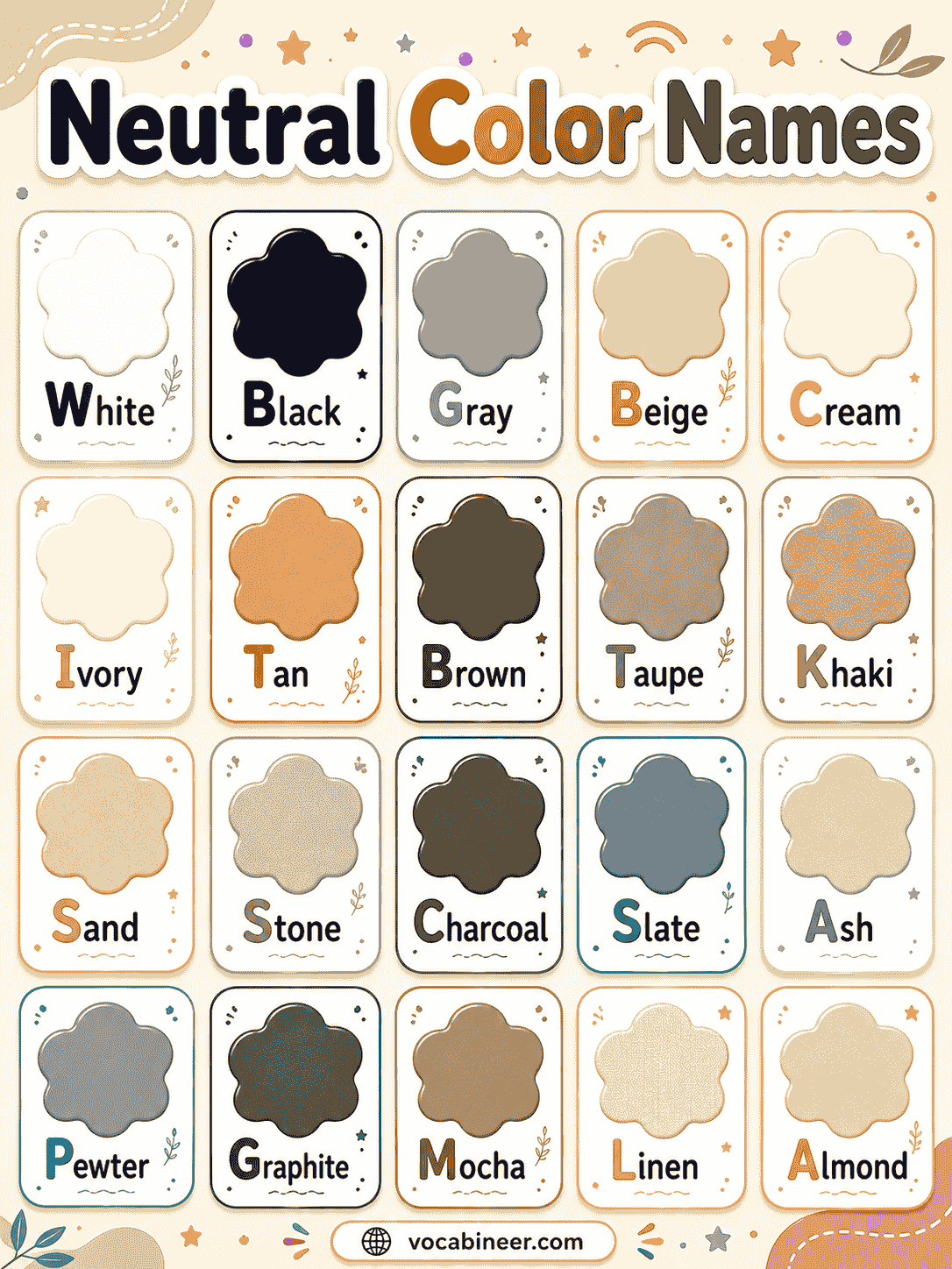
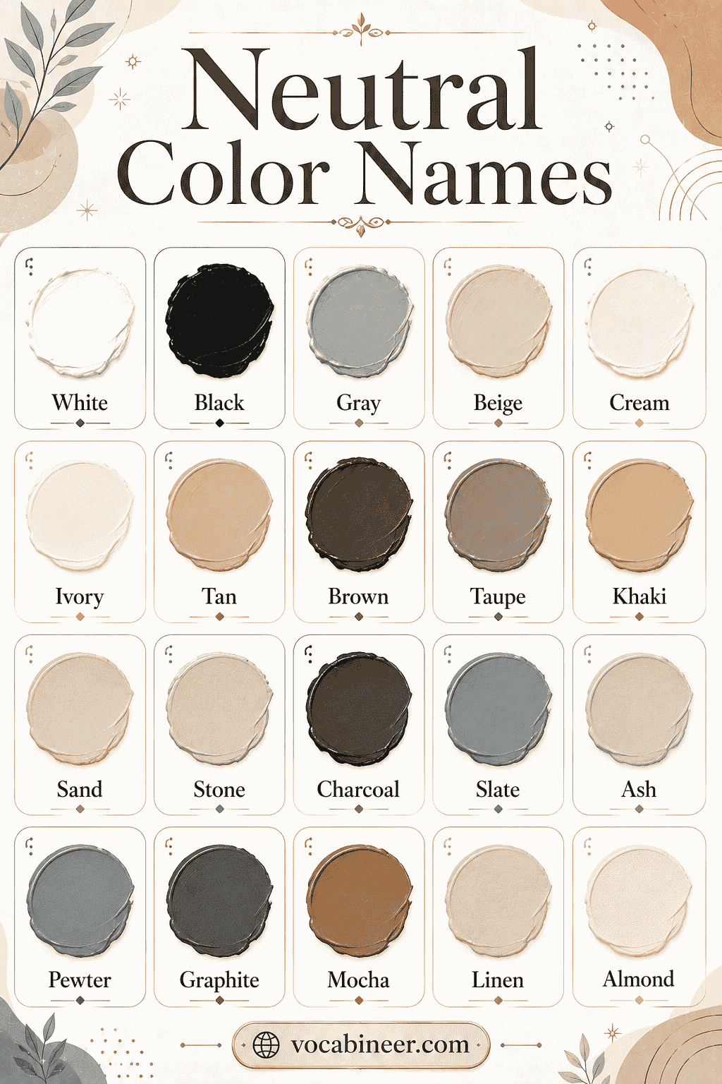
Common Neutral Colors with Pictures
These neutral color names are useful for kids, students, artists, writers, and beginners. Each card gives a simple meaning that is easy to understand.
White
A very light neutral color that looks clean, bright, and simple.
Black
A very dark neutral color often used for strong, classic, or formal looks.
Gray
A balanced color between black and white.
Light Gray
A soft gray shade that feels peaceful, clean, and fresh.
Dark Gray
A deeper gray shade that looks serious, smooth, and stylish.
Charcoal
A very dark gray color that feels bold, polished, and sleek.
Beige
A pale brownish color often used in clothes, walls, and furniture.
Cream
A soft yellowish-white color that feels warm and gentle.
Ivory
A smooth off-white color that looks soft, elegant, and light.
Off-White
A white shade with a small touch of cream, beige, or gray.
Brown
An earthy neutral color connected with wood, soil, and nature.
Light Brown
A soft brown shade that feels warm, natural, and friendly.
Dark Brown
A rich brown color that looks deep, strong, and classic.
Tan
A warm light brown color often seen in bags, shoes, coats, and sand.
Taupe
A muted mix of gray and brown that looks calm and stylish.
Greige
A modern neutral color made by mixing gray and beige.
Sand
A pale beige color inspired by beach sand.
Stone
A soft gray-beige color inspired by natural stone.
Mushroom
A muted brown-gray shade that feels earthy and soft.
Almond
A pale beige-brown color inspired by almond nuts.
Mocha
A rich brown color inspired by coffee and chocolate.
Ash
A cool gray shade that looks soft, smoky, and muted.
Slate
A dark gray shade with a slight cool tone.
Linen
A soft off-white or pale beige color inspired by natural fabric.
Bone
A pale off-white shade that looks warmer than pure white.
Complete Neutral Colors List
Neutral color names can be simple or more specific. Some names are classic neutrals, while others are soft near-neutral shades used in fashion, paint, and design palettes.
Useful neutral colors include:
- White
- Black
- Gray
- Light gray
- Dark gray
- Charcoal
- Beige
- Cream
- Ivory
- Off-white
- Brown
- Light brown
- Dark brown
- Tan
- Taupe
- Greige
- Sand
- Stone
- Mushroom
- Almond
- Mocha
- Ash
- Slate
- Linen
- Bone
- Khaki
- Pewter
- Graphite
- Espresso
- Camel
- Oatmeal
- Ecru
- Putty
- Dove gray
- Warm gray
- Cool gray
- Smoke
- Clay beige
- Fawn
- Coffee
- Cocoa
- Walnut
- Chestnut
- Dusty gray
- Pearl
- Porcelain
- Vanilla
- Biscuit
- Cashmere
- Pebble
Neutral Color Hex Codes
Hex codes are useful for websites, digital art, posters, worksheets, and graphic design. These codes help designers choose exact neutral shades.
Some neutral shades can have different hex codes depending on the palette, so these are common example codes rather than the only correct versions.
| Neutral Color | Hex Code |
|---|---|
| White | #FFFFFF |
| Black | #000000 |
| Gray | #808080 |
| Light Gray | #D3D3D3 |
| Dark Gray | #555555 |
| Charcoal | #36454F |
| Beige | #F5F5DC |
| Cream | #FFFDD0 |
| Ivory | #FFFFF0 |
| Off-White | #FAF9F6 |
| Brown | #964B00 |
| Tan | #D2B48C |
| Taupe | #8B8589 |
| Sand | #C2B280 |
| Linen | #FAF0E6 |
| Bone | #E3DAC9 |
Types of Neutral Colors
Neutral colors can be grouped by how they look and feel. Some are warm and cozy, while others are cool, clean, dark, or earthy.
| Type of Neutral Color | Examples | Feeling |
|---|---|---|
| Warm neutrals | Beige, cream, tan, camel | Cozy and soft |
| Cool neutrals | Gray, ash, slate, pewter | Calm and modern |
| Light neutrals | White, ivory, linen, bone | Clean and bright |
| Dark neutrals | Black, charcoal, espresso, graphite | Bold and elegant |
| Earthy neutrals | Brown, sand, stone, mushroom | Natural and grounded |
| Modern neutrals | Greige, charcoal, slate, warm gray | Stylish and simple |
Warm Neutral Colors
Warm neutral colors have a soft, cozy feeling. They often include hints of yellow, brown, orange, or red.
Common warm neutral colors include beige, cream, tan, camel, almond, oatmeal, warm gray, and brown. These shades are popular in home design because they make rooms feel comfortable and welcoming. They also work well in fall outfits, natural color palettes, and soft classroom designs.
Examples of warm neutral colors:
- Beige
- Cream
- Tan
- Camel
- Almond
- Oatmeal
- Warm gray
- Light brown
- Sand
- Chestnut
Cool Neutral Colors
Cool neutral colors often include hints of blue, green, or cool gray. They usually feel calm, clean, and modern.
Common cool neutral colors include gray, ash, slate, pewter, charcoal, cool gray, and smoke. These colors are often used in websites, offices, modern homes, technology branding, and simple outfits.
Examples of cool neutral colors:
- Gray
- Ash
- Slate
- Pewter
- Charcoal
- Cool gray
- Smoke
- Graphite
- Dove gray
- Dusty gray
Light Neutral Colors vs Dark Neutral Colors
Light and dark neutral colors affect a design in different ways. Lighter neutrals can make a space feel soft, open, and airy, while darker neutrals add strength, depth, and contrast.
| Feature | Light Neutral Colors | Dark Neutral Colors |
|---|---|---|
| Meaning | Clean, soft, open | Bold, serious, elegant |
| Examples | White, ivory, cream, linen, bone | Black, charcoal, espresso, graphite |
| Best use | Walls, backgrounds, soft outfits | Contrast, formal looks, strong designs |
| Visual effect | Makes spaces feel bigger | Adds depth and drama |
| Common mood | Gentle and peaceful | Strong and stylish |
Earthy and Modern Neutral Colors
Earthy and modern neutral colors can make a design feel natural, clean, and stylish. Nature-inspired shades bring warmth and grounding, while modern neutrals work well in websites, branding, furniture, and simple home designs.
Useful earthy and modern neutral colors include:
- Brown
- Sand
- Stone
- Mushroom
- Clay beige
- Taupe
- Cocoa
- Greige
- Charcoal
- Slate
- Graphite
- Off-white
- Pewter
- Ivory
- Cream
- Linen
- Bone
- Soft gray
- Light taupe
Neutral Colors for Kids
Kids can learn neutral colors by connecting them with objects they see every day. This makes color vocabulary easier to remember.
Simple examples of neutral colors for kids include:
- White paper
- Black shoes
- Gray clouds
- Brown soil
- Beige sand
- Cream ice cream
- Tan bag
- Charcoal pencil marks
- Ivory soap
- Light gray stones
Neutral Colors Examples in Sentences
Example sentences help learners understand how to use neutral color names in real life. These sentences are short and easy to read.
- She wore a beige sweater to school.
- The sofa is cream and brown.
- He bought a pair of black shoes.
- The wall is painted light gray.
- White paper is on the desk.
- My bag is tan and simple.
- The artist used charcoal gray in the drawing.
- Their living room has ivory curtains.
- A brown table stood near the window.
- The website uses an off-white background.
- Her coat is a soft camel color.
- The stone path looked gray and natural.
Neutral Color Palette Ideas
Neutral color palettes help you combine shades in a clean and stylish way. These palettes can work for rooms, outfits, websites, posters, and branding.
| Palette Name | Colors | Best For |
|---|---|---|
| Soft Minimal | White, ivory, beige, light gray | Clean designs and websites |
| Cozy Warm | Cream, tan, camel, brown | Living rooms and fall outfits |
| Modern Gray | White, ash, slate, charcoal | Offices, tech brands, websites |
| Earthy Calm | Stone, mushroom, taupe, brown | Nature themes and home decor |
| Classic Elegant | Black, white, gray, ivory | Formal fashion and branding |
| Sandy Neutral | Sand, beige, cream, light brown | Beach themes and soft interiors |
| Coffee Palette | Mocha, espresso, cream, tan | Cafes, packaging, cozy designs |
| Soft Classroom | Off-white, pale gray, beige, cream | Worksheets and learning visuals |
Colors That Go with Neutral Colors
Neutral colors are easy to match because they work well with many bright, soft, warm, and cool colors.
| Neutral Color | Colors That Go Well With It |
|---|---|
| White | Black, navy, green, red, gold |
| Black | White, gray, beige, silver, red |
| Gray | Blue, yellow, pink, white, black |
| Beige | Brown, cream, olive, navy, gold |
| Cream | Tan, brown, sage, peach, gold |
| Brown | Beige, green, cream, orange, white |
| Charcoal | White, teal, mustard, blush, silver |
| Taupe | Ivory, sage, black, dusty pink, brown |
| Tan | White, denim blue, olive, cream, black |
| Ivory | Gold, beige, brown, blush, sage |
For a calm look, pair neutral colors with other soft shades. However, for a bold look, add one strong accent color like red, navy, emerald green, or gold.
Best Neutral Background Colors
Neutral background colors help text, images, and designs look clean and easy to read. They are useful for websites, worksheets, posters, slides, social media graphics, and presentations.
Good neutral background colors include:
- White
- Off-white
- Ivory
- Cream
- Light gray
- Beige
- Sand
- Pale taupe
- Linen
- Soft greige
Best Neutral Colors for Clothes, Walls, Websites, and Art
Different neutral colors work better for different uses. This table gives simple suggestions for everyday design and style choices.
| Use | Best Neutral Colors |
|---|---|
| Clothes | Black, white, beige, gray, brown, tan |
| Walls | Cream, beige, off-white, light gray, ivory |
| Websites | White, off-white, light gray, charcoal |
| Art backgrounds | Beige, gray, cream, black, white |
| Furniture | Brown, cream, tan, black, gray |
| Branding | Black, white, charcoal, beige, greige |
| School projects | White, gray, beige, brown, cream |
| Posters | White, cream, charcoal, light gray, tan |
Neutral Colors in Fashion
Neutral colors are popular in fashion because they are easy to wear and simple to match. They can make an outfit look classic, casual, soft, or elegant without using bright shades.
Common neutral clothing colors include:
- Black
- White
- Gray
- Beige
- Cream
- Brown
- Tan
- Charcoal
Navy is not a true neutral, but many people use it like one because it matches so many outfits.
Neutral Colors in Home Design
Neutral colors make homes feel calm, clean, and comfortable. They are often used on walls, sofas, curtains, rugs, beds, and furniture because they match many styles.
Popular neutral home colors include:
- White
- Beige
- Cream
- Gray
- Greige
- Taupe
- Brown
- Charcoal
Light neutrals can make a room feel bigger and brighter. In contrast, darker neutrals add depth, strength, and elegance.
Neutral Colors in Art, Branding, and Design
Neutral colors are useful in art and design because they create balance. They can make bright colors stand out, soften busy layouts, or give a project a clean and professional look.
Common uses of neutral colors include:
- Art backgrounds for drawings, paintings, posters, and classroom projects
- Shadows and details in sketches, portraits, natural scenes, and objects
- Brand logos that need a simple, classic, or professional style
- Website layouts where text, buttons, and images need clear contrast
- Product packaging that should look elegant, minimal, or natural
Neutral Colors vs Warm Colors
Neutral colors and warm colors create different moods. Warm colors often feel brighter and more energetic, while neutral shades feel calmer, softer, and easier to match.
| Feature | Neutral Colors | Warm Colors |
|---|---|---|
| Main feeling | Calm and balanced | Bright and energetic |
| Examples | White, gray, beige, brown | Red, orange, yellow |
| Strength | Usually soft or simple | Often bold and lively |
| Best use | Backgrounds, outfits, interiors | Accents, highlights, attention |
| Visual effect | Creates balance | Adds warmth and energy |
Warm colors can be used with neutral colors to create a lively but balanced design. For example, beige and orange feel warm, while gray and red create strong contrast.
Neutral Colors vs Cool Colors
Neutral colors are balanced shades, while cool colors usually include blue, green, and purple tones. Cool colors often feel fresh, peaceful, or relaxing.
| Feature | Neutral Colors | Cool Colors |
|---|---|---|
| Main feeling | Simple and balanced | Calm and fresh |
| Examples | Beige, black, gray, ivory | Blue, green, purple |
| Temperature | Not strongly warm or cool | Usually cool |
| Common use | Base colors and backgrounds | Relaxing or natural themes |
| Matching style | Matches many colors easily | Works well with soft neutrals |
Gray, ash, slate, and charcoal can sometimes feel cool because they have a calm, modern look. However, they are still often grouped as neutral colors.
Neutral Colors vs Earth Tone Colors
Neutral colors and earth tone colors can overlap, but they are not exactly the same. Earth tones are inspired by nature, while neutral colors are known for balance and easy matching.
| Feature | Neutral Colors | Earth Tone Colors |
|---|---|---|
| Meaning | Balanced colors that match easily | Colors inspired by nature |
| Examples | White, black, gray, beige, brown | Brown, clay, olive, rust, sand |
| Feeling | Simple, calm, classic | Natural, warm, grounded |
| Color range | Can be light, dark, warm, or cool | Usually warm and natural |
| Common use | Fashion, design, backgrounds | Nature themes, decor, art |
Brown, sand, stone, and taupe can belong to both groups because they are neutral and earthy.
True Neutral Colors vs Near-Neutral Colors
Some colors are true neutrals, while others only look neutral because they have soft or muted color tones.
| Feature | True Neutral Colors | Near-Neutral Colors |
|---|---|---|
| Meaning | Have little or no strong color tone | Look neutral but include a slight color tint |
| Examples | Black, white, gray | Beige, cream, taupe, greige |
| Look | Plain and balanced | Softer, warmer, or cooler |
| Common use | Contrast and simple designs | Fashion, decor, and palettes |
| Color feeling | Very simple | More natural or stylish |
For example, pure gray is a true neutral color. Beige is a near-neutral color because it has a small warm tone.
Are Neutral Colors Boring or Stylish?
Neutral colors are not boring when they are used well. They can look clean, elegant, cozy, modern, or natural depending on the shade and combination.
A room with only plain beige may feel dull, but beige with wood, plants, white curtains, and brown furniture can look warm and beautiful. In the same way, a black-and-white outfit can look simple but stylish when the pieces fit well.
Neutral colors become more interesting when you add texture, contrast, layers, patterns, or one accent color.
Tips for Using Neutral Colors
Start with one main neutral color, then add one or two matching shades. For example, you can use cream as the main color, tan as the second color, and brown as the darker accent. This keeps the design simple but not flat.
Also, think about contrast. Light neutral colors need darker shades to stand out, while dark neutral colors often look better with white, cream, silver, or gold. When a design feels too plain, add texture through fabric, wood, paper, stone, plants, or small patterns.
FAQs
Neutral colors are balanced colors that do not look too bright or strong. Common neutral colors include white, black, gray, beige, cream, brown, ivory, tan, taupe, and charcoal.
The most common neutral colors are white, black, gray, beige, brown, cream, ivory, tan, and charcoal. These colors are often used in clothes, homes, art, and design.
Yes, beige, brown, black, white, and gray are all neutral colors. Beige and brown are warm or earthy neutrals, while black, white, and gray are true neutral colors.
Many colors go well with neutral colors. Blue, green, red, gold, pink, yellow, silver, and white can all match different neutral shades.
Neutral colors are balanced shades that match easily, such as white, gray, beige, black, and brown. Earth tones are inspired by nature, such as clay, sand, olive, rust, stone, and soil brown.
Summary
Neutral colors are calm, balanced, and easy-to-match shades. Common examples include white, black, gray, beige, cream, ivory, brown, tan, taupe, charcoal, and off-white. These colors are useful in fashion, home design, art, websites, branding, and everyday English because they create a simple and stylish look. By learning neutral color names, meanings, palettes, and combinations, students and beginners can describe colors more clearly and use them with confidence.
Read More
- Colours Names in English
- Gold Colored Things Names
- Types of Dark Colors
- Types of Warm Colors
- Light Color Names
- Types of Cool Colors